Our Year in Review
Hello Hello
How are you this fine chilly morning? Hopefully great with a cuppa java to boot!
I am good...with said coffee in hand and find myself with an unexpected day off today due to a sick kiddo. I figured it would be a good idea to keep her home from school since she is running a fairly high temperature...so here I am again...finally I should say...after being gone from the blog for a bit.
So what to share?
I'm thinking that I will share this...my 2015 highlights mini waterfall booklet. I was on burn-out bad last year and did not hardly do any scrapin' of any sort, nor did I really take any everyday photos. I took quite a few on our 'staycation' but that was one week out of the whole year and an accurate account of our year it does not make so I had to come up with a way to capture our year in the simplest format and this is what I ended up with.
I'm thinking that I will share this...my 2015 highlights mini waterfall booklet. I was on burn-out bad last year and did not hardly do any scrapin' of any sort, nor did I really take any everyday photos. I took quite a few on our 'staycation' but that was one week out of the whole year and an accurate account of our year it does not make so I had to come up with a way to capture our year in the simplest format and this is what I ended up with.

Essentially I made a booklet and down both sides I used the waterfall technique to create the pages. Each page has one month assigned to it, along with a photo and a journal block, so the left side of the booklet is January through June and the right side is July through December. I am actually quite fond of this booklet because although simple - it is a more accurate account of our year, plus being super simple it also lends it's self to that fact that I did not do a whole lot in the scrap booking realm either.

For the photos I used my Instagram feed and just printed those at home at 3 x 3, then cut them out and added them in. For the journal blocks I printed off the sheet of journal lines I made about a year ago, cut them down to size also so that they would fit in my photo mats as well. I think if I were to do this type of booklet again, I would keep it the same size for sure, which is roughly 3 and a 1/2 inches wide by almost 6 inches tall by about 1 inch thick, but I'd flip flop the card stock colors. Instead of doing white mats on a black base, I would do black mats on a white base.

The reason I think that I would switch it up is because not only would the photos pop out a bit more...so would my journal blocks, I am just not caring for the white against white even though it is the same card stock. Also I would use just one color to document the moments in instead of using all different colors...reason being...some of the darker colors are hard to read because my journal lines are fairly small. I should have stuck with an in between color throughout
...but...
live and learn.
...but...
live and learn.

At the end of the waterfall on both sides of the booklet I added in these little bitty pockets that have the string closure, thinking this is just another simple layer of interest in our year review. Inside of them I included a couple of clothing tags, a ticket stub, a receipt or two and quite possibly a few other things as well and that pretty much sums it all up. As I said I had a fairly simple year last year, not doing much beyond a few big projects and lots and lots of reading so...

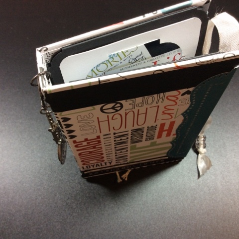
Last but not least here is my front cover, I kept it fairly simple as well since that has been the style throughout. I did however add a few charms along the spine of the booklet...I have a couple of watch hands plus a philosophy tag that says, 'simplify' and a word token that says, 'moments' both of which of course are totally fitting for this book and my whole year to be completely honest. For the closure I had added the seaming binding on the inside covers before I added on my waterfall pieces and so it just ties closed...again...simple.
Hope you like it and I hope you have a wonderful day. If you have any questions please comment me and I'll be happy to answer.
Thanks for taking a peek!
just B
.jpg)
Comments