L is for Liberty
Hello Hello
and Good Morning!
How is everyone this fine day?
I am finally back up and running (not with scissors though I assure you) so without further ado I have something to share. I was needing to get some better photos of this one so I decided to try hanging it up on our living room wall and that seemed to work so this is where I will start for today.

This piece is a paper mache letter 'L' that I did for my oldest daughter for Easter 3 years ago. I had been wanting to do an altered letter for each of my girls for awhile but never knew which direction I wanted to go...one day I finally just decided to go and not worry about it. Turns out - there was nothing to worry about they each have their letters hanging in their room and whether it matches the rest of their stuff doesn't seem to matter to them, as it is this one still matches my oldest daughter's room.

so how I started my process was to paint the back and both sides with a black acrylic paint and it doesn't have to be perfect one coat should be fine - once dry go over it with a second coat of crackle medium this one definitely needs lots of dry time - after that I added a 3rd coat of white acrylic which by this point you have to work quickly because it activates the crackle medium and if you don't move fast it'll end up to thick to make the cracked effect (at least this has been my experience in the past) - for the last step I used my black soot distress ink and lightly inked all the edges.

When I was happy with what I had I took a close up shot of it with my camera so that I would have a reference point - took all my pieces off and began adhering everything down, now my pieces weren't super small so that certainly helped because otherwise it would have taken forever being that this letter is about 2 feet tall.

When I had all the pieces adhered down I went back over the whole and added one more layer of mat gel just to be sure I had it down super good, then I let it all dry overnight. My next step was to add the white paint around all the facing edges, so I took a dry paint brush just barely dipped it into my white paint, brushed most of it off onto a paper towel and then did a messy dab to the edges of my letter, this adds another shabby chic layer and if you do it extremely light the first time and it's not enough for you, you can repeat the process - the key is to use a 'dry' brush with very little paint.


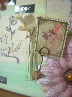
Okay so now comes the fun part which is decorating it, I used a random supply of things in my stash. I tried to get lots of older products in here just to use them knowing full well that neither of my girls would care if they even realized it.
Being that this was such a large letter I decided to do several embellishment clusters instead of one large embellished spot and I am happy with the way it turned out I wasn't sure if it would look funny but as it happens it looks just fine.

So for one cluster I used my label maker and created a couple of keywords then finished that with a small bunch of flowers and a pearl button.
For the second and third embellishment spots I used mesh tape to define the space. On the mid-left spot I used a ribbon to define the top edge of the mesh and then on the bottom edge I added a string of black sequins then directly underneath that I added in my flower bunch with a word token and a fabric label. At the top of this embellishment spot I included the butterfly - I wanted the butterfly to appear as if it were about to take flight which is why I placed him at the top edge verses the bottom.

For the third and final embellishment spot I again used the mesh tape to define the main space and for the right edge I went ahead and finished it with a ribbon piece as well but on the left edge I decided to leave it open so that when you look at the whole piece it's almost as if the bottom of the letter has created it's own embellished space, having not closed off the left side leaves a gradual flow within that space without disrupting the whole piece. I did add in a few other decorative bits...of course the flower bunch was a must in order to keep the continuity and the pearl gems helps tie this spot into the other spot on the top left but the journal card was certainly new, lucky for my girl it hides a private message to her.

Here's my final piece
thanks for stoppin' by and I hope you have a fabulous day!
just B
.jpg)
Comments