Learning to Love Layouts
Good Day All!
Today, as promised, I am going to share with all of you some layouts I have done for the design team. I was asked by Carolyn to pick several papers that she had an excess of and to do 12 x 12 layouts; so I grabbed what caught my attention and went from there. Now as most of you know layouts are really not my thing, I don't do a lot of them and therefore I am not comfortable with them, but I tried and that's gotta be worth something. For starters, I had to get inspired and needed a jumping off point, so I turned to my trusted friend "Page Maps" here and found a layout in there that I thought would work well.


Turns out that that is all the help I needed, just a little something to get my motor running and here you have it, a completed 12 by 12 layout.

Along the bottom of the layout I finished off my title and hung it from the sheer ribbon, love things that hang off of something else, adds so much more depth and dimension.


Here is the next 12 by 12 layout I came up with and honestly I 'believe' I came up with this one on my own, but I won't swear to it....meaning I didn't use a sketch........can't find one in the book like this but that doesn't mean it isn't there. Either way though, I like this layered look. Would be a great layout for lots of birthday photos, do the best ones front and center, and make them pop off the page, that would be great.


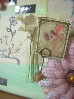
Here are a couple of close ups: the first of the title, and the second of the flowers that I grouped together up in the right hand corner.


(**gentle reminder that I don't do layouts so anything that looks remotely professional-I am happy with) this is where I prove my influence - I have been inspired for a very long time by scrapbooker/memory keeper, Ali Edwards here, and this layout I think shouts her influence. The clean lines, the graphic look, the very simple embellishments or lack there of, and spots for some very large photos.


My favorite embellishment is the royal crest in the upper right hand corner, that is a Tim Holtz's die here. I absolutely love that man's creative genius! The flourish cut-outs that adorn the bottom left hand corner and the center label, along with the label are also by Tim. If I have a favorite brand in scrapbook products based on what I already own, I think hands down it would be Tim Holtz's products but a very close runner up would be 7 Gypsies here (they have awesome products as well).


The next layout I did also had more of a graphic look to it but this time I added a bit more 'stuff', in fact in this layout, the design of it is more meant to show case 'ephemera' rather than photos. Yes, by all means you could throw lots of pictures on here or you could put the photos in the middle and then add the receipt, and ticket stubs, and parking ticket, etc along the side lines. What a great way to include all those little things that you know you all are saving, especially when all those added together helps you tell a much brighter and fuller story, those little bits help the story to come alive and I totally love that.

Here is a closeup of what I did along the side lines, I used one of Tim Holtz's stamp sets and made the little advertisement labels to fill in the 'white space', but that could be easily replaced with whatever you have on hand.


I have to make a disclosure real quick, I did mention that I am a huge Tim Holtz fan correct?... so when I tell you that this next layout is totally a Tim product page, you won't sue me...right? : )
As you may have guessed, this page uses two of Tim's new stamp sets. I absolutely love this page: besides loving the stamps, I also love how I themed the whole page around the sewing stamp set, with the dress maker label, the thread & needle label, the dress form, the fabric swatches (made from the pattern paper which happen to be double sided), and then the trim options. I think I totally nailed the concept I was going after and for that I am so proud of this one.

Another reason that I have used a lot of Tim Holtz products within my design work is because I know that is something the store always carries and if they don't have it, they will order it. For those of you who don't know, when you are doing design work the idea is to help people understand 'how' to use a certain product and that in turn will help 'sell' product and thus keep the scrapbook industry alive. The draw back is that most store owners don't keep older products unless it's a staple within scrapbooking - like..... silver brads or a square punch, those things are used all the time by lots of people so it makes sense to have them; but for someone like me who has 15+ years in this hobby and has a ton of product (lots of new but also lots of old) it was hard to keep up with all the new and they weren't so easy to 'give' just anything to me to use (usually only paper, ribbon, chipboard cut-outs and the essentials) so it definitely made it a challenge.
so there you have it.... the reason for my obsession with Tim. : )


A good example for the explanation above: here in the layout above, Carolyn had a lot of this pattern paper that wasn't selling (probably several months old now), so she wanted her DT (design team) to make something with it that would inspire others to buy it and therefore getting it off the shelf so that they could put out something new that was selling. Not many people want to scrap a layout with paper that is more than a couple years old, a lot like myself who still has pattern paper from when I first started into this hobby, which in this industry is ancient, and probably why it's still stacked in my cropper hopper. Yikes!!!

Okay so now that I've fallen into a rabbit hole with all the DT explanations, I will try to find my way back. Here is the last layout I did for the design team, the only single page layout that I did in this bunch and I guess technically the last project I did. This one took me a while, I had tried several other attempts but nothing had panned out until I went back to my tried & true which was using a Tim Holtz product, so here you have it, the last layout standing.


First up is the tattered floral die that I used in several places on the layout, I love using dies because they are easy and you can use them on about any kind of paper product and you can use them over & over & over. Some of your heavier items like: chip board, book board, or even some cardboard won't cut well if at all, but most of the paper stuff will and then some other elements like: fabrics, vinyl, and even some scrapbook metal will. Dies are such a versatile tool, that's why they are so popular now.


Speaking of dies - the other die that I used on this layout was another Tim Holtz one, the butterfly die (forgive me I can't remember the name of it) and with it I used that same pattern paper as the 'sewing' layout I did, but this time I made the paper the butterfly's pattern. In this layout I also played around with one of Martha Stewart's punches, this one is the kind that give you the option to punch an entire border including the corners or not. I love this punch system, to be able to do my own die cut border without having to invest in my own personal die cutter, I absolutely love it.
So there you have it, all of it. Hope you have enjoyed looking as much as I enjoyed creating!
thanks for stopping in and i hope you'll pop in again, until then
just B......inspired!
So there you have it, all of it. Hope you have enjoyed looking as much as I enjoyed creating!
thanks for stopping in and i hope you'll pop in again, until then
just B......inspired!
.jpg)
Comments